Branding is key, and having a strong logo makes sure your audience knows which door to open to find yours. With this value in mind, I am starting with designing a logo for my business card. By beginning with this, I can spend the week refining the image while I continue to develop the other aspects of the project- since most of them are much more cut-and-dry.
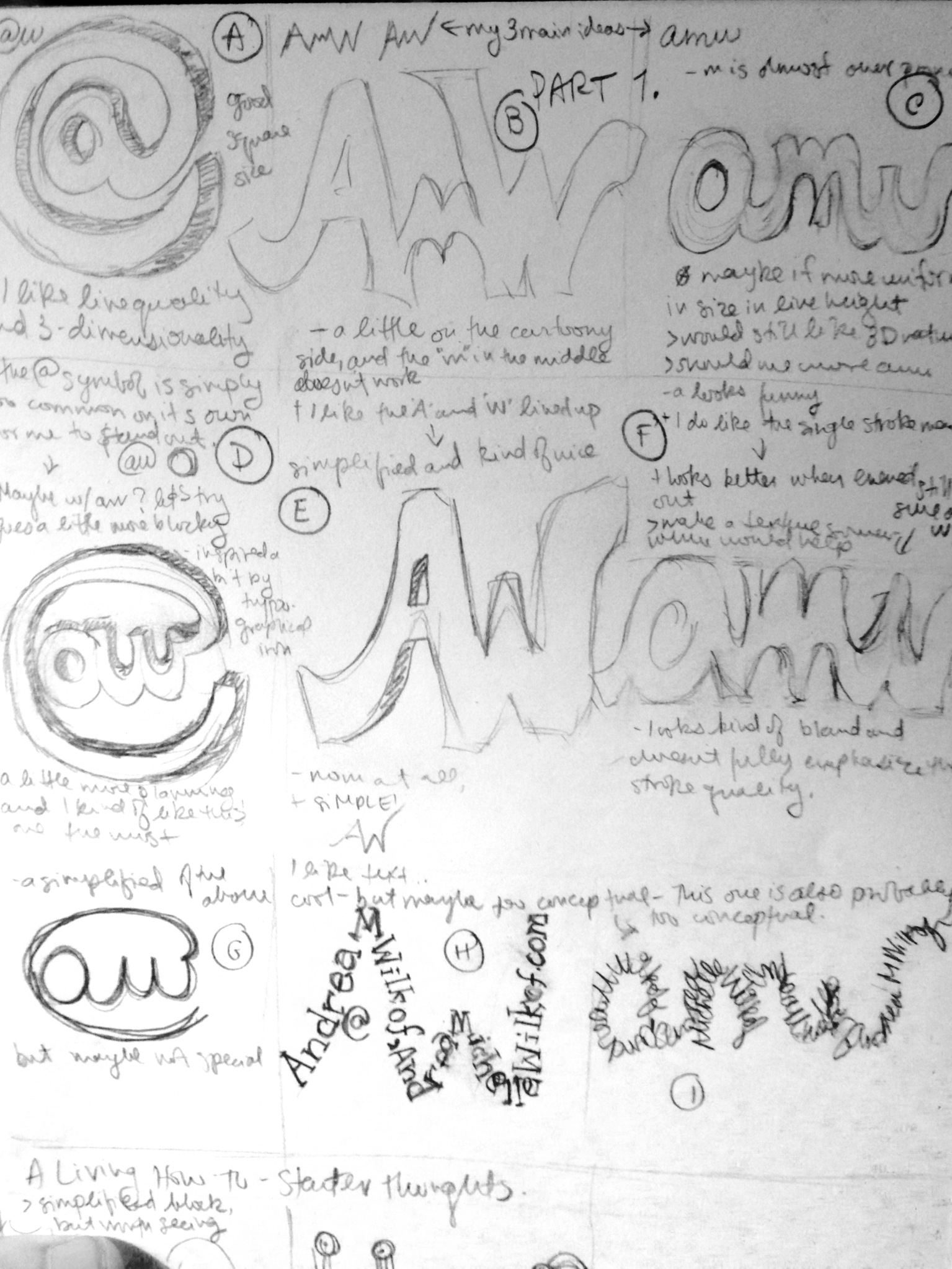
Here are nine very casually sketched logos, using my initials (AMW and AW). From personal and external feedback, so far I am leaning towards a second generation of 2 main concepts evolving. Specifically, combining D and E, as well as creating H on with typed text and possibly having more than one line of text per stroke.
Here is where you come in: what are your thoughts on the above 9 logos? Leave your feedback in the comments and stay tuned for tomorrow’s turns.